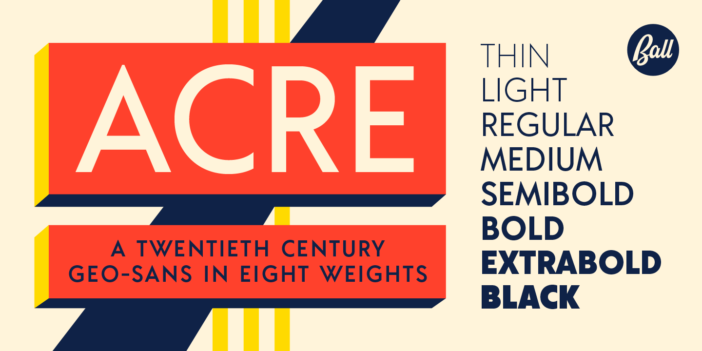
Acre Font
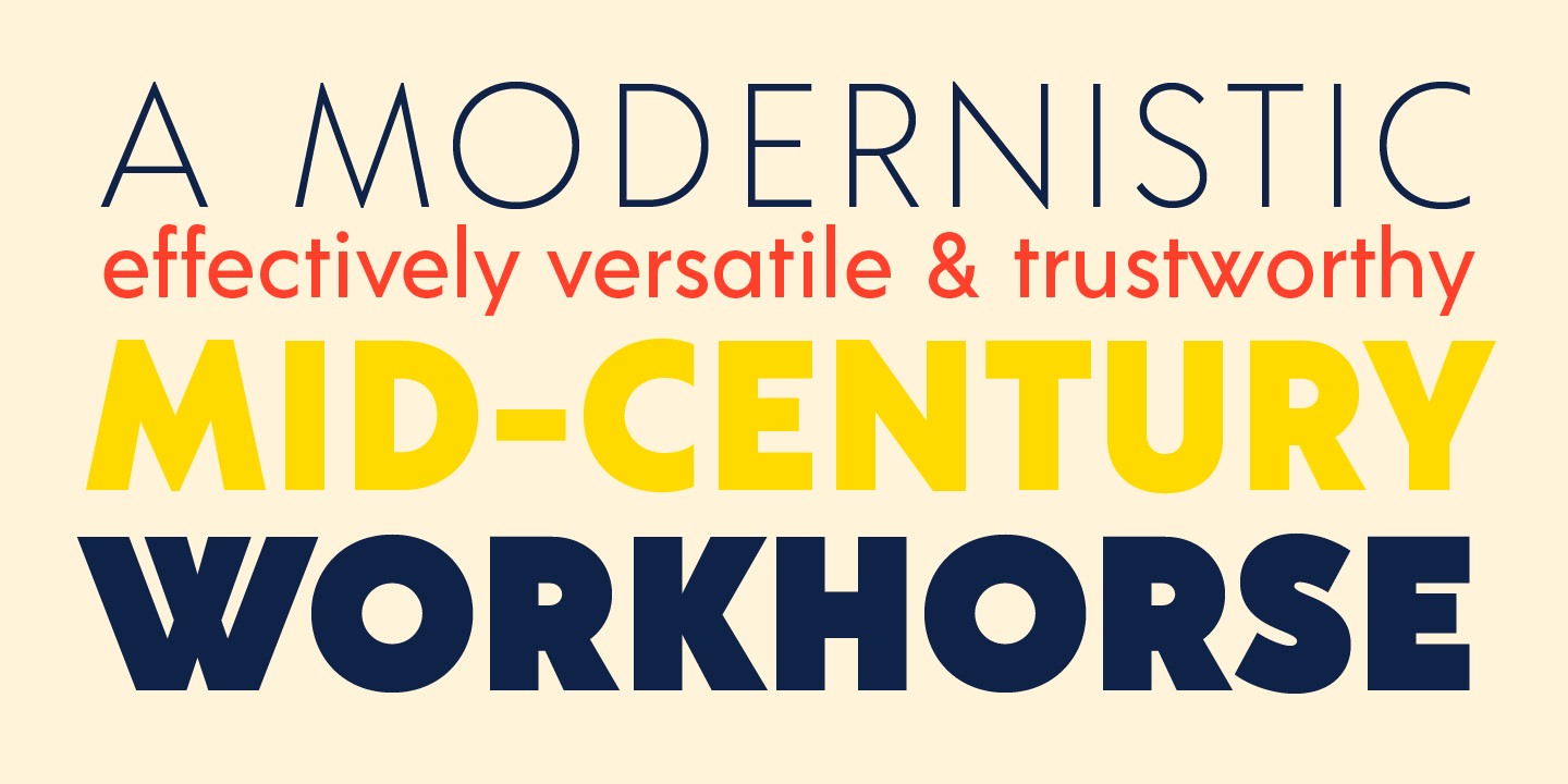
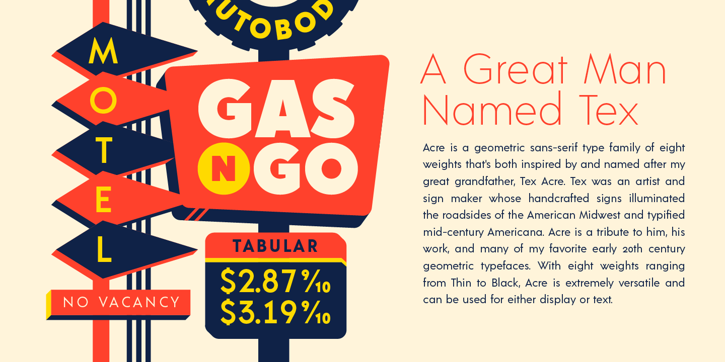
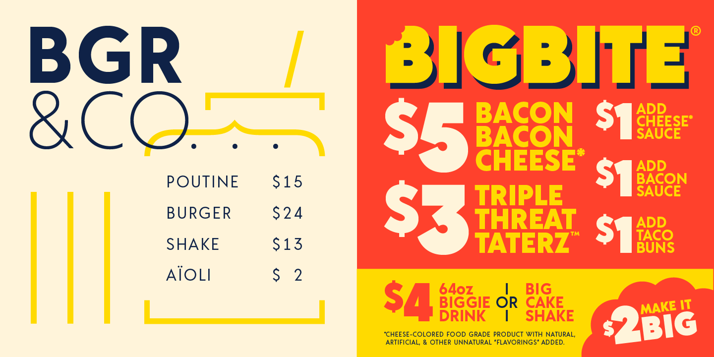
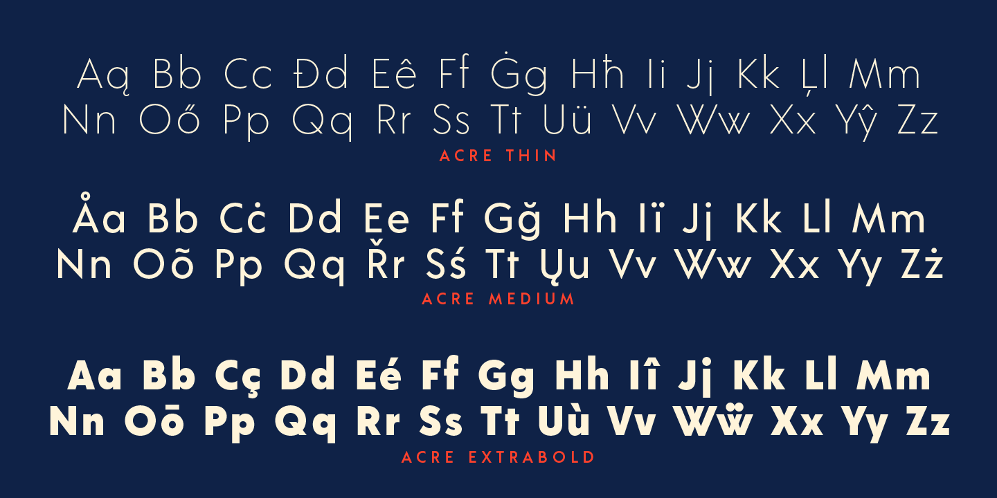
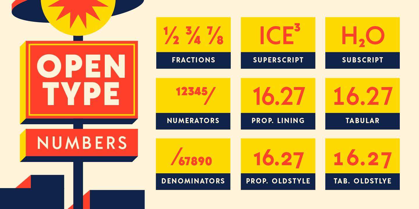
Acre is a geometric sans-serif type family of eight weights that’s both inspired by and named after my great grandfather, Tex Acre. Tex was an artist and sign maker whose handcrafted signs illuminated the roadsides of the American Midwest. The Acre typeface is a tribute to him, his work, and many of my favorite early 20th century geometric typefaces. With eight weights and Opentype figures, Acre is an extremely versatile family that can be used for display, text, or anything in between. Get the Acre Medium for free.
-
Styles
-
- Thin
- Light
- Regular
- Medium
- Semibold
- Bold
- Extrabold
- Black

Featured